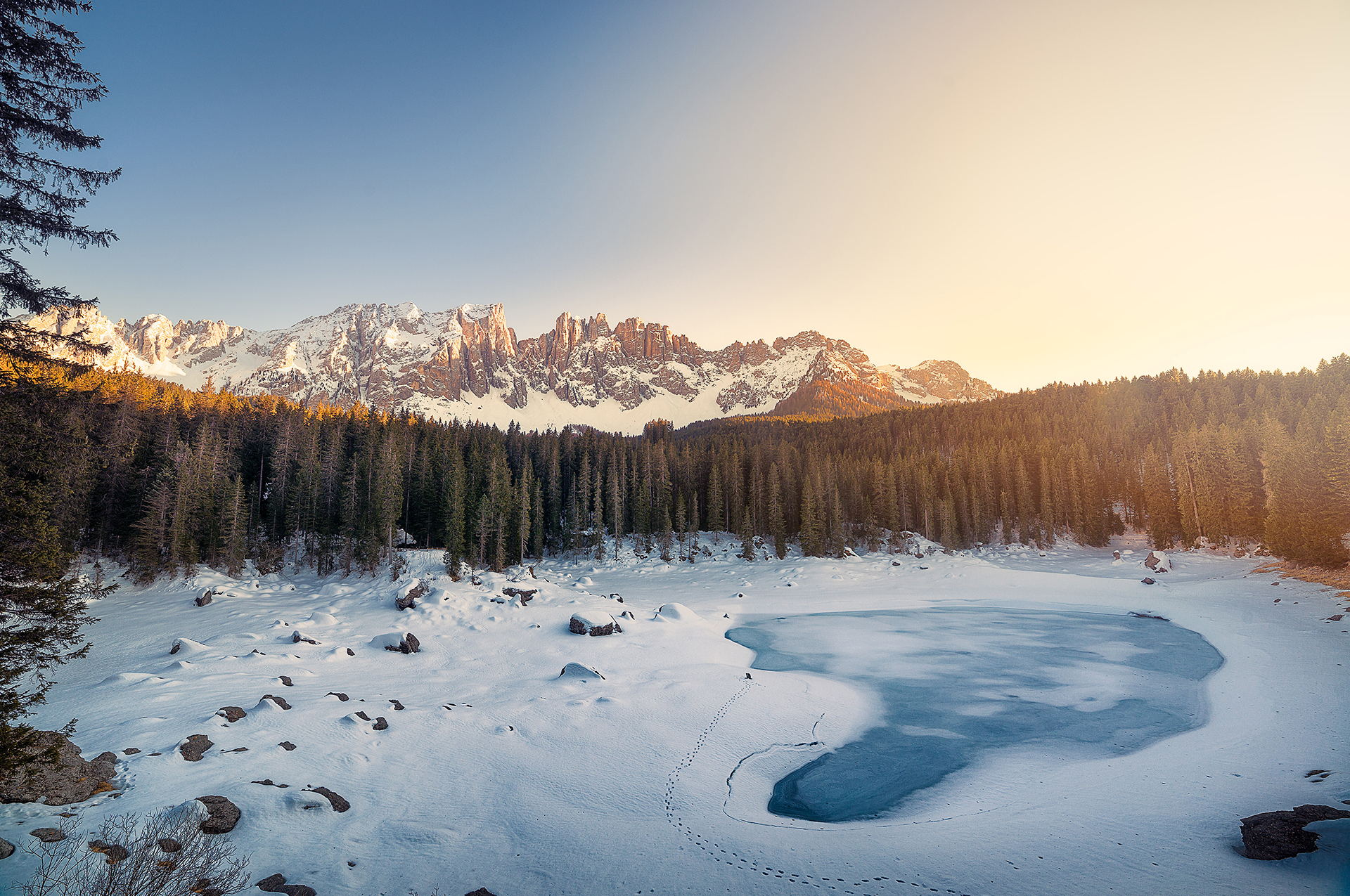
A layout that flows like water
The fluid layout creates a responsive slider that always takes the size of its container.
The background image can be anchored in a position of your choosing, so it always looks great. It scales beautifully as the wrapping container becomes larger or smaller. This layout is perfectly suited for all use cases.
What does the container look like?
A container can be anything you’d like. The example above uses a fixed 400px height with a 100% width.
<div id="my-container" style="width: 100%; height: 400px;">
  <!-- Slidea -->
  <div class="slidea">
    <!-- Slide -->
    <div class="slidea-slide">
      <!-- Background -->
      <!-- To change the background, modify the src=".." attribute -->
      <img class="slidea-background" src="assets/img/slide-1.jpg">
    </div>

    <!-- Slide -->
    <div class="slidea-slide">
      <!-- Background -->
      <!-- To change the background, modify the src=".." attribute -->
      <img class="slidea-background" src="assets/img/slide-2.jpg">
    </div>
  </div>
</div>
To use the fluid layout, simply set it as the layout parameter in the slider settings. The fluid layout also has a layoutSettings parameter which allows you to set the preferred fluid mode and the background image anchor.
$('.slidea').slidea({
  layout: "fluid",
  layoutSettings: {
    anchor: 'center', // center, top, bottom, left, right, top-left, top-right, bottom-left, bottom-right
    size: 'fluid' // fullscreen, screenHeight, screenWidth, fluid
  }
});
| Option | Description |
|---|---|
| anchor | Sets the background anchor position. The center anchor will always keep the image centered.Values: "center", "top", "bottom", "left", "right", "top-left", "top-right", "bottom-left", "bottom-right" |
| size | Sets the responsive fluid. The fullscreen size will give you slider which always spans the whole window size.Values: "fullscreen", "screenHeight", "screenWidth", "fluid" |
Previous
Default LayoutRead Next
Fullscreen Fluid Layout

